Case study · 02 of 06
Harbor Sweets
Fourteen years designing an American chocolate icon’s equestrian collection — from the molds themselves to the packaging to the catalog on the coffee table.
- Client
- Harbor Sweets
- Engagement
- Product design, packaging, catalogs, brand identity
- Duration
- Fourteen years
- Founded
- Salem, Massachusetts, 1973
The story
Harbor Sweets has been handcrafting chocolates on the Salem, Massachusetts waterfront since 1973. When they trusted Mary with their equestrian-themed confection line, she didn’t just design the wrapper. She designed the chocolate.
The Dark Horse Chocolates molds — the physical shape of the confection itself — came from Mary’s hand. So did the packaging concept that turned each piece into a character. The Peanut Butter Pony lives in its own “stable,” a package designed so the chocolate is displayed as if it belongs there. Packaging becomes storytelling. Product becomes experience. This is the level of detail-obsessed, brand-native thinking that separates design from craft.
She didn’t just design the wrapper. She designed the chocolate.
The collection
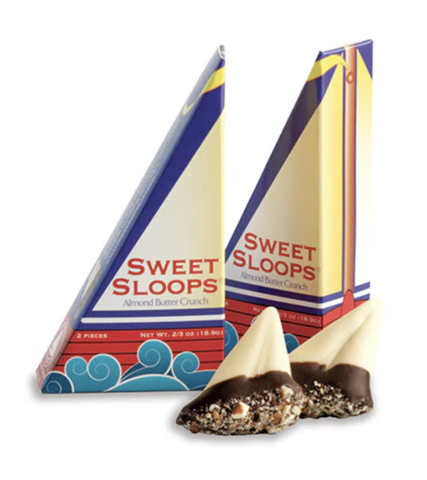
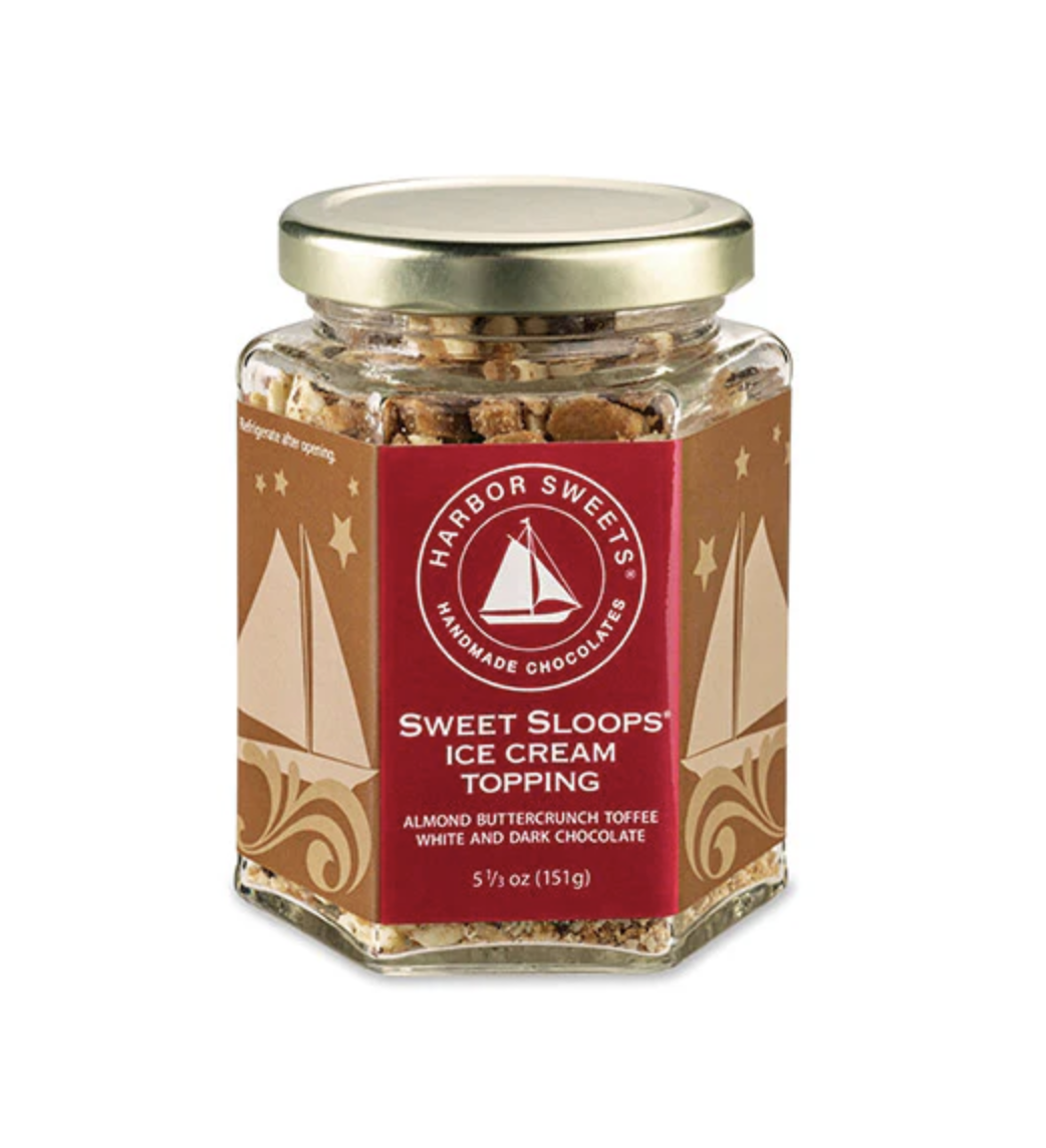
Over fourteen years, Mary shaped the entire visual world of Harbor Sweets’ equestrian collection. Catalogs, advertising, seasonal campaigns — every piece designed with the care of a limited-edition print, not a mass-market sell sheet. The Sweet Sloops packaging, with its nautical sailboat silhouette, is a masterclass in how physical packaging can carry a brand’s heritage and personality without saying a word.
The relationship lasted fourteen years not because of a contract, but because when you find someone who treats your brand like their own, you don’t let go.
By the numbers
- 14
- years of creative partnership — fourteen catalogs, seasons, and holiday campaigns
- 1
- chocolate mold designed from scratch — the Dark Horse itself
- 1973
- the year Harbor Sweets began, in a shop on the Salem waterfront
- 0
- off-the-shelf wrappers, templated labels, or recycled layouts
Services delivered
From the mold to the mailbox, a single hand.
- Product design (chocolate molds)
- Packaging design and production
- Catalog design and editorial layout
- Brand identity
- Seasonal campaign creative
- Photography art direction
- Copywriting